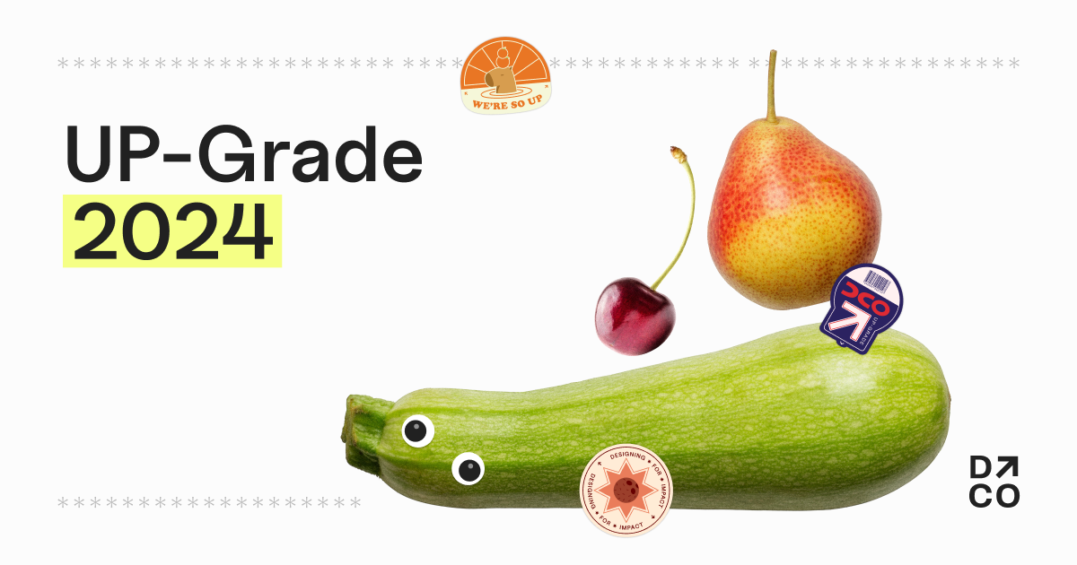
Upgrade 2024
Design Co
UP-Grade is Design Co's 10-week summer internship-style program where students will get the opportunity to work alongside a local, nonprofit organization to elevate their branding and boost their exposure within the community.
Key Results
- Implemented a dynamic fruit basket with 2D physics, enhancing user engagement and creating a playful, interactive experience that became a key feature of the homepage.
- Optimized Responsive Design for Enhanced Accessibility: Adapted the design to remove fixed height scroll snap on mobile devices, switching to an infinite scroll approach to improve user experience and accessibility across different screen sizes.
- Streamlined Development Workflow: Implemented a new branching strategy with a develop branch to effectively manage and resolve merge conflicts, resulting in a smoother development process and quicker progress.
Role
Frontend Developer
Timeline
May 2024 - July 2024
Skills Used
- React
- Typescript
- SCSS
- Radix
- Matter.js
Project Overview
The UP-Grade internship program, developed by Design Co, is a 10-week summer initiative that allows students to work with local nonprofit organizations. The aim is to elevate their branding and boost their community exposure. For this project, my role was as a Frontend Developer, where I collaborated closely with a team of designers and developers to bring the site to life.
The project featured a playful and vibrant design, incorporating elements such as fruits and gamified interactions. I worked on several aspects of the website, including the Themes and FAQ pages, alongside implementing interactive UI features.
Design and Development Process
Design Direction:
The design theme was inspired by a playful aesthetic, complete with googly eyes, fruit stickers, and an interactive fruit basket element. We drew inspiration from the popular Suika Game, which led to the idea of fruits falling from the sky, adding a sense of whimsy and dynamism to the experience. The design evolved to include:
- 2D Physics Interaction for the landing page fruit basket
- Receipt-style Navigation for easy browsing
- Draggable Fruit Stickers to engage users interactively
Challenges:
One of the most challenging design elements was the fixed height scroll snap navigation. The receipt navigation, while central to the visual identity, turned out to be a responsive nightmare, particularly when scaling for different screen sizes. The limitations of scroll snap were more restrictive than anticipated, leading to a series of design iterations. The fixed scroll height was difficult to adapt to mobile devices where scrolling is a natural behavior. After numerous iterations and close collaboration with the design team, we decided to drop the scroll snap for mobile users, ultimately creating a better, more intuitive experience.
Technical Challenges & Solutions
Responsive Design: Developing a website with fixed height scroll snap required multiple iterations to ensure the content didn’t overflow awkwardly on different devices. Initially, we struggled with fitting all the content into a user’s screen on mobile without allowing for scrolling. Since this approach was not feasible for mobile, we opted for an infinite scroll for better user flow.
For desktop versions, we kept the scroll snap but had to fine-tune edge cases where content slightly overflowed. This process involved collaborating with the design team to make small adjustments and ensure consistency.
Tooling & Libraries:
In terms of technical solutions, we employed various tools and libraries that were new to me:
- Radix Components: I got the opportunity to work with Radix UI components, which I quickly grew to appreciate for their flexibility and headless design, allowing me to focus on functionality rather than styling.
- Keen Slider: For implementing the mobile theme slider, I utilized the Keen Slider library. This was a lightweight, straightforward solution that allowed for a smooth mobile experience without adding unnecessary complexity.
Collaboration & Workflow
This was my second time working on a large React project with a team of developers. One of the biggest learning points was improving our workflow to manage and resolve merge conflicts. In our first Design Co project, multiple developers working on different feature branches led to significant merge conflicts towards the end. For this project, we introduced a develop branch as a staging area for all feature branches. This allowed us to resolve conflicts before submitting pull requests to the main branch, making the process much smoother and efficient.
Key Takeaways
- Component-Based Development: This project was my first in-depth experience with component-based development, which is crucial for scalable and maintainable web applications. It provided me with a deeper understanding of how to structure and manage reusable components.
- Merge Conflict Resolution: By implementing a more structured git workflow, I learned how to better manage merge conflicts, improving collaboration efficiency within the team.
- User-Centered Design: The challenges we faced with scroll snapping taught me the importance of user control and how rigid UI elements can hinder user experience. This reinforced my belief that, unless absolutely necessary, design elements should be intuitive and flexible.
Conclusion
The UP-Grade internship program website was a valuable project that not only enhanced my frontend development skills but also taught me important lessons about collaborating on a team, handling design constraints, and managing complex interactions. The final product successfully conveyed the playful nature of the internship program while maintaining a user-friendly, accessible experience.